
Mailer McGuire
I was engaged to design the branding and packaging of Mailer McGuire, an Australian tea-based Kombucha.
2017-19
Background
Founder Rosie Morison came up with her business idea while taking a cycling and camping trip along coast from Vancouver to San Fransisco.
Responsibilities
Branding · Packaging · Illustration · Photography
Awards
AGDA Design Award Finalist 2018—Packaging
AGDA Design Award Finalist 2018—Packaging

Founder Rosie Morison came up with her business idea while taking a cycling and camping trip along coast from Vancouver to San Fransisco.
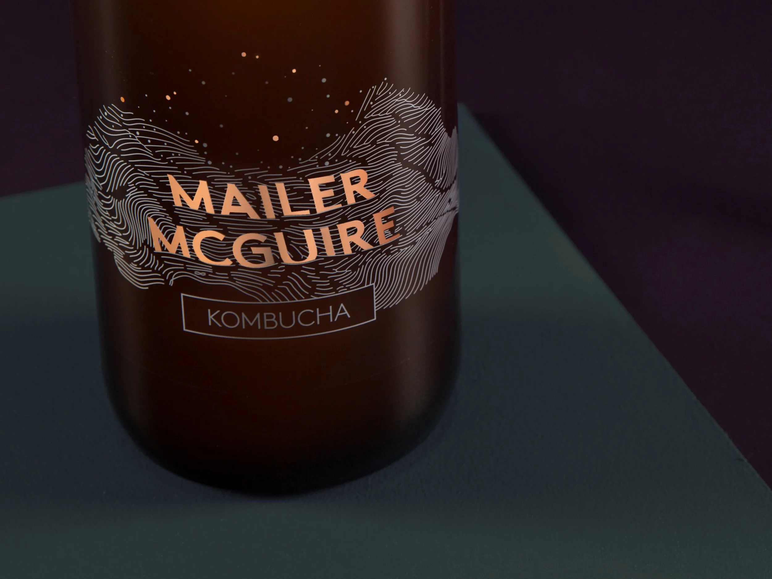
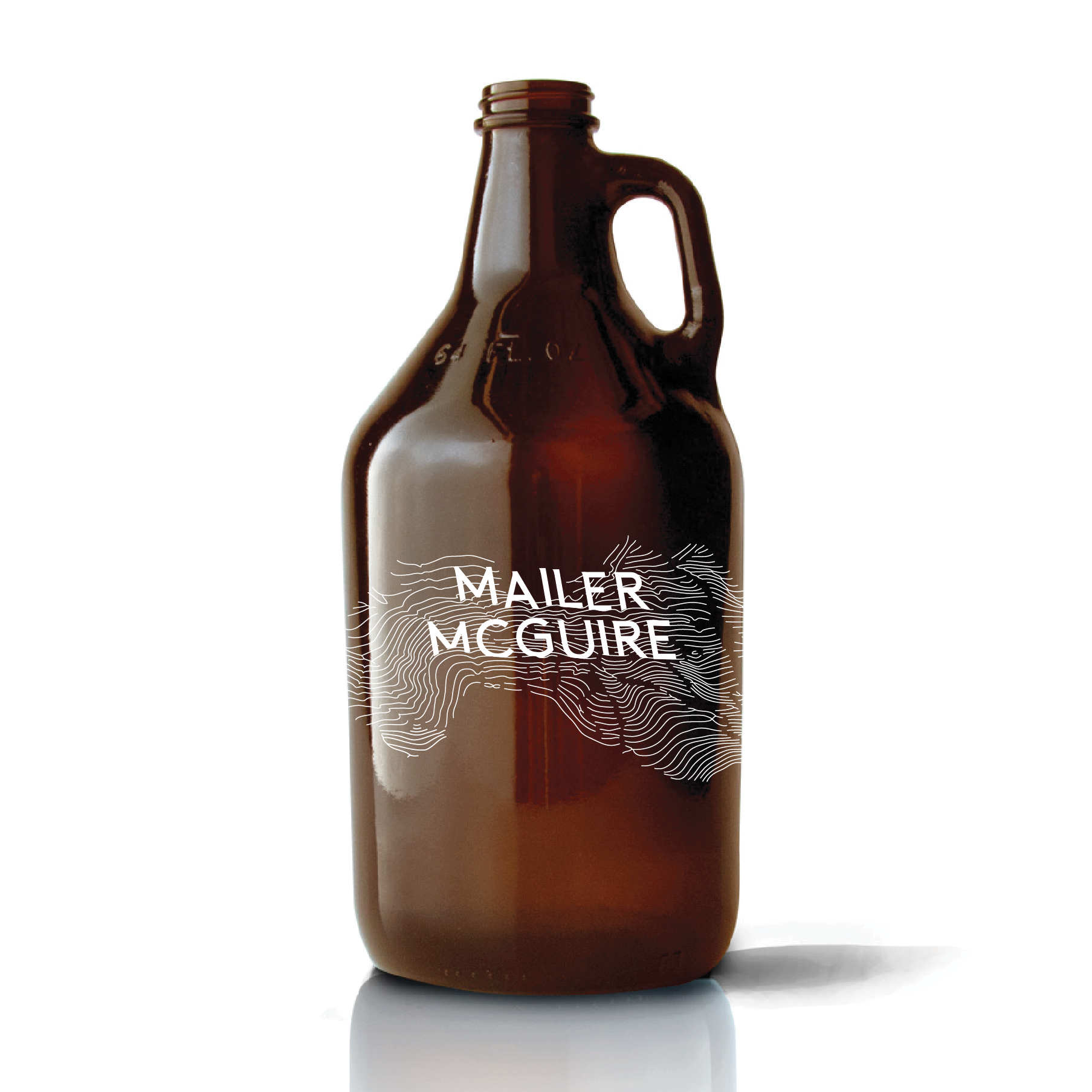
In homage to her adventures in North America, I drew inspiration from the linework and undulations of map contours. I anchored the letters of the logotype like rocks in a river of flowing linework, as they weave around them and generate a sense of movement.


These are some of my early concepts, where I explored how to capture the movement & flow of liquid, and how it would all take shape together.


The illustration in the final logo design can be read in multiple ways, as the shape also forms mountains under a starry night sky—a reference to the mountain ranges where the tea is sourced.


